
PRACTICAL GUIDE
Image optimization: size, format and loading
Prepare lighter images with readable detail, appropriate dimensions, useful alt text and correct loading for the first screen.
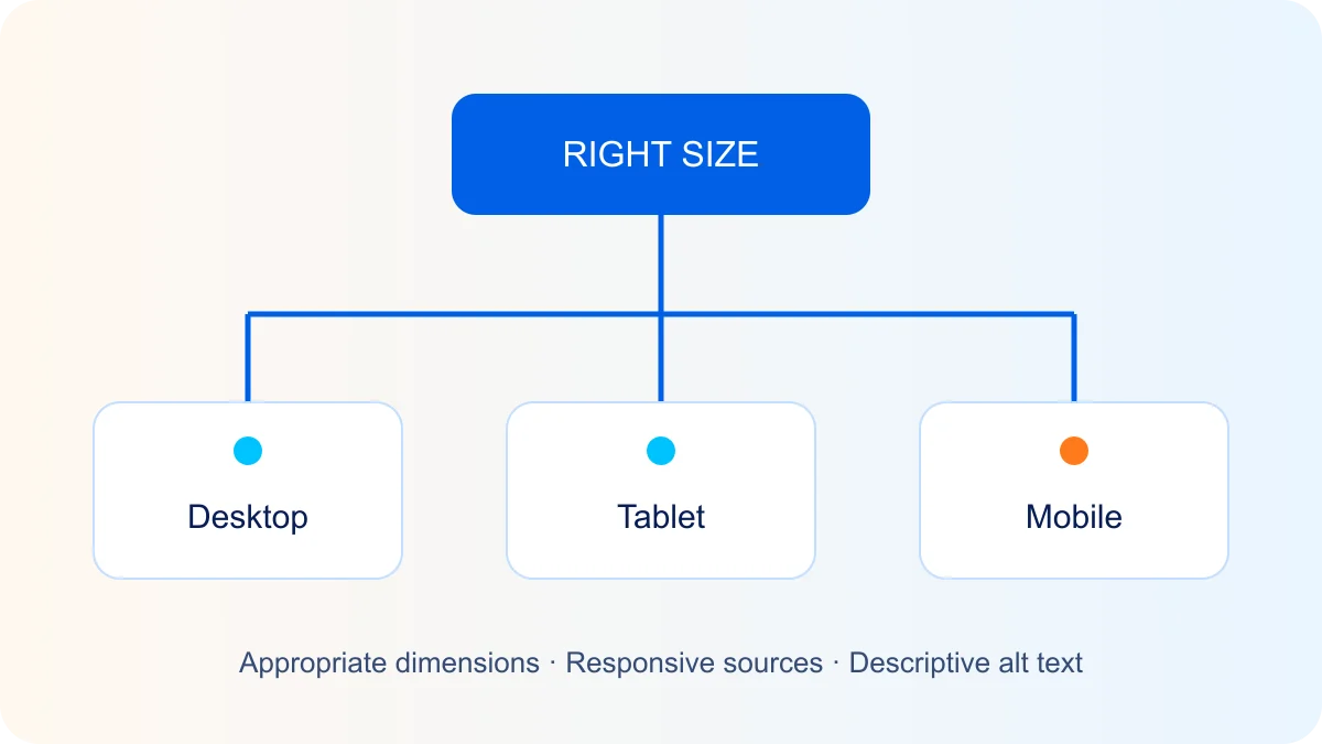
Start with the image’s actual use
A 4,000-pixel-wide photograph is usually unnecessary for a small card. Choose dimensions based on the component width and display density. Inspect the file actually loaded, not only its CSS display size.
Format and compression
JPEG suits many photographs; PNG preserves detail losslessly and supports transparency; WebP and AVIF often produce smaller files. Results depend on the image and settings, so compare quality and size. SVG suits icons and diagrams, but untrusted SVG code needs safe handling.
Responsive dimensions
Use srcset and an accurate sizes attribute so the browser can choose a variant for the layout. Set width and height or the correct aspect ratio to reserve space before loading and reduce layout movement.
Lazy loading with the right exception
Lazy loading is useful for images below the first screen. Avoid it on the main hero image when that image matters for LCP. Make the image discoverable early in the HTML and give it suitable priority. Browsers may load lazy images shortly before they enter the viewport.
Alt text and file data
Describe the information conveyed without keyword stuffing. A decorative image usually needs an empty alt attribute. Remove unnecessary EXIF data, including location where it serves no purpose; retain necessary rights and provenance information.
Tools and verification
TinyPNG, ImageOptim, Compressor.io and Optimizilla are examples of file-processing tools. ImageOptim is a macOS application, not a WordPress plugin. For WordPress, assess Smush, ShortPixel or EWWW against their features, licence and your workflow. Avoid enabling multiple competing lazy-loading systems.
Check the page in PageSpeed Insights and on a real phone. Compare LCP, CLS, network requests and image clarity. A laboratory test does not replace real-visitor data.